


How Healthy Is Your City? Interactive Map Shows Health For 500 US Cities
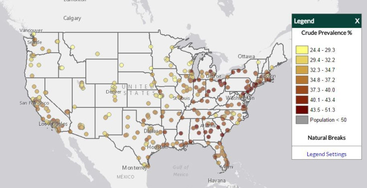
How healthy is your city? You can now find out through a new, interactive health map of the United States’ 500 largest cities.
The web application is part of the “500 Cities Project,” which provides local data for better health. The project is a collaborative effort of the Centers for Disease Control and Prevention (CDC), The Robert Wood Johnson Foundation, and CDC Foundation.
Read: An Interactive Guide Lays Out How We'll Die, Depending On Our Age, Gender, And Race
This is a first-of-its kind tool, Donald F. Schwarz, vice president for the program at the Robert Wood Johnson Foundation, explained in a press release. It’s the first time the public can access city and neighborhood health data and compare it to cities across the nation.
The map includes a wide range of information and breaks it up into three categories: unhealthy behaviors, health outcomes, and preventions.
Unhealthy behaviors allows you to look at the annual prevalence data of adults ages 18 years and greater who binge drink, smoke, aren’t physically active, are obese, and who usually get insufficient sleep.
Health outcomes provide data for 14 conditions including arthritis, cancer, mental health condition, and stroke. Lastly, prevention data includes nine different sets of information, such as lack of health insurance, dental visits, and mammography use.
The intention of the map is for public health professionals to be better able to plan and target interventions for specific areas of the country.
“The 500 Cities Project reflects an innovation in health data for more than 100 million people -- a third of the U.S. population,” Schwarz said.
The data used to create the map is from the U.S. Census and a health survey called the CDC’s Behavioral Risk Factor Surveillance System.
To see how healthy your city is, check out the map here.
See also: Interactive Map Shows How Long The Average Erect Penis Is In Every Country Around The World
New Brain Map Marks Nearly 100 Unmapped Regions, Helps Scientists Better Understand Cerebral Cortex


