


What Not To Wear: Excessive Color Matching Seen As A Fashion Faux Pas, Says Science
Fashion icons such as Victoria Beckham, Lupita Nyong’o, and Solange Knowles, have popularized monochromatic color sets for the past two seasons, making it a fashion “do,” while science says it’s a “fashion faux pas.” While keeping up to date with the hottest trends is thought to give us an “edge” and make us appear “fashion forward,” this color matching may actually be unaesthetically pleasing to the eye. According to a recent study published in the journal PLOS ONE, moderately matching in color is perceived to be more fashionable than those that are highly matching, or highly clashing, suggesting a balance between simplicity and complexity — the Goldilocks Principle — is the science behind style.
“[M]atching colors makes an outfit look more fashionable, but only up to a point — once the colors start becoming too similar, or if many items in the outfit are the exact same color, there is a steep decline in how good the outfit looks,” said Nina Strohminger, post-doctoral associate at the Duke University Fuqua School of Business, in the news release. This observation may reflect a more general aesthetic preference that is connected to the visual system — what color combinations are simply more pleasing to the eye? This link between color coordination and fashionableness could hold the key to the aesthetic domain of what is simply more flattering to onlookers.
To test whether the Goldilocks Principle is seen in fashion, Strohminger and her colleagues recruited a cohort of men and women through Amazon’s Mechanical Turk. A total of 239 participants — 69 percent women with an average age of 35 — were each shown 30 different color combinations, in one of four color palettes. The palettes one and two were in women’s clothing, and palettes three and four were in men’s clothing, which each palette including four colors.
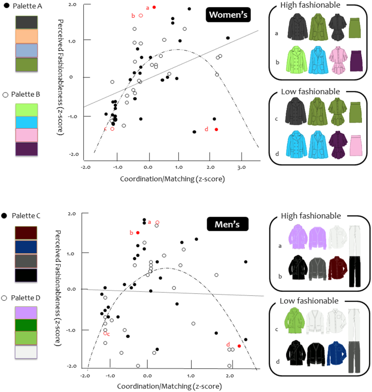
The researchers showed the participants' outfits in a variety of color combinations, then got two sets of ratings. The first was related to preference — how much people liked the outfits, how good the outfits looked, and how fashionable they were. The other set was about coordination — how similar each pair of colors was, and how much they matched. For example, in the study, lime green and pink are different, whereas black and dark gray are identical. Muted green and gray lie somewhere in between these two.
The findings revealed matching color does make an outfit more fashion forward, but when there tends to be too much color coordination, the outfit begins to lose its appeal. Possible explanations for this finding may be connected with cultural norms where society is taught to be mindful of clothing choices, but not to the point that it’s too noticeable. “Maximum fashionableness is attained when outfits are neither too coordinated nor too different,” wrote the study authors.
This science verdict is not surprising to the researchers, since it seems to go hand in hand with our behavioral tendency to find the balance between extremes. The application of the Goldilocks Principle in fashion is supported by infants' preference for looking at visual sequences that are neither too complex nor too simple, according to a 2012 study published in the journal PLoS ONE. Infants avoid wasting their cognitive resources on overly simple, or overly complex events.
These findings also suggest we are what we wear. A stylish outfit will influence the perceptions of our other qualities, which means we should be mindful of how much we color coordinate our clothes. Since fashion is constantly changing, it’s important to remember moderate matching is not the only key to fashion, as cut, design, and trendiness are also factors to consider.
Fashion is like any cultural phenomenon that needs more scientific research. For the self-proclaimed fashionably challenge, this study can be fitting. For the trend-setters, continue to break the rules of fashion, because it may eventually catch on.
Source: Gray K, Kassam KS, Schmitt P, Strohminger N. The Science of Style: In Fashion, Colors Should Match Only Moderately. PLOS ONE. 2014.
Aslin RN, Kidd C, Piantadosi ST. The Goldilocks Effect: Human Infants Allocate Attention to Visual Sequences That Are Neither Too Simple Nor Too Complex. PLOS ONE. 2012.


