


Got The Blues? Sadness Changes How You See The Color Blue, But Not Red
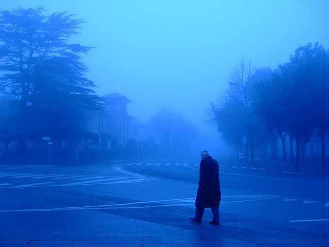
Are you feeling blue or do you have a case of the mean reds? A new University of Rochester study suggests our ability to perceive color may indeed be flavored by our moods. In two experiments, people who felt sad performed worse on a color accuracy test than those who felt either amused or neutral.
"Data are beginning to emerge supporting the conventional wisdom that people’s emotions influence how colorful the world looks to them," wrote the researchers in their conclusion.
If recent data is to be believed, color may influence cognition and behavior, say the researchers. Experiments have shown "exposure to the color red can subsequently impair performance on challenging cognitive tasks, elevate the perceived attractiveness and health of faces, and reduce food intake," they wrote. Exploring in a similar vein, this team of University of Rochester researchers performed two distinct experiments.
The first began with 129 college students, 83 female, watching either a sad or amusing film clip. After watching the clips, participants were tested for how they were feeling. As expected, those who had watched the sad clip reported more sad feelings, while those who had watched the funny clip experienced greater amusement. Next, the research team tested the participants on color perception accuracy.
Here, the participants viewed 24 separate color patches created in Adobe Photoshop on a computer screen. For each patch, participants indicated whether the color patch was red, yellow, green, or blue. Participants saw each color patch twice, for a total of 48 random trials.
The results from this first experiment indicated sad participants performed worse on a color-perception task than amused participants, yet this was only true for colors along the blue-yellow axis. Along the red-green axis, the tested mood states of participants didn't influence perception accuracy.
Because the results could not indicate whether sadness impaired color perception (or whether amusement enhanced it), the researchers decided to run a second experiment. This time, they roughly followed the guidelines of the first experiment, except instead of half the participants seeing an amusing film clip, they watched a neutral clip. Importantly, the researchers converted all the film clips to gray scale "to control for any possible color-fatigue effect that might have been caused by the films' own colors," they noted.
Following the clips, the participants were tested on both emotional state and color perception. Compared to those who’d watched the neutral clip, sad participants were less accurate in perceiving color along the blue-yellow axis, though equally accurate along the red-green axis.
"We are speculating that dopamine deficiency might influence [perception of blue-yellow] colors, because past research has shown that perception of these colors is affected in clinical disorders in which dopamine plays a role," Dr. Christopher A. Thorstenson, department of clinical and social sciences in psychology, told Medical Daily in an email. "It is very important to note that we did not measure dopamine, and so cannot say if this is the case."
Source: Thorstenson CA, Pazda AD, Elliot AJ. Sadness Impairs Color Perception. Psychological Science. 2015.


