


USDA's Hundred Years Of Food Supply Trends Are Now Available

Are we eating the same way as our great-grandparents were? From the meat and potatoes staple of the early 1900s to today’s fish and brown rice recommendations, our nation’s food supply is greatly dictated by the demand, and it shows in a one-of-a-kind chart. The United States Department of Agriculture (USDA) has taken 100 years of nutritional data and created a chart for an easy-to-use guide for understanding our nutrient intake over the years.
By measuring the flow of raw and processed foods throughout the U.S. market, the USDA Economic Research Service (USDA/ERS) food availability data series in graph forms, provides a unique window into how the American food supply responds to political, social, and economic changes along with constant technological advancements. It has been used to monitor the potential of the food supply, nutritional needs of the U.S. population, and to use as a tool to examine historical trends and evaluate changes in the American diet.
The data has evolved from using it as a survey to make sure America was prepared for World War II, to now where it is has become a major component of the nation’s nutrition monitoring system. For comparison basis, the USDA published its first comprehensive data system in order to assess the availability of 18 food commodities. By 1961, the USDA was using the system to measure the per capita availability of 53 commodities, which includes the supplies of seafood, home-canned fruits and vegetables, and game meat. Today, the data covers several hundred commodities; however, game meats and home-produced foods are no longer included.
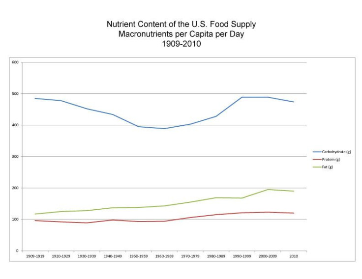
The series provides data for overall calorie consumption, calories yielded from specific macronutrients, which are protein, carbohydrate, and fat. By looking at the chart, the U.S. is coming down from a high point in carbohydrate intake per day, which has brought us to the same level as 1909s carb consumption. Both our fat and protein intake has been steadily rising throughout the century and is now higher than it has ever been. However, the fats are significantly higher than the proteins.
The food availability of the entire country is taken into account, which means it calculates the annual supply of each commodity as the total production, inventory, imports, then subtract exports, farm, industrial, and other nonfood uses. At the end of the year, the ERS’s data set in has a complied account for every grocery store, restaurant, school cafeteria, and every eating establishment. The per capita estimates are determined by dividing the total availability by the U.S. population, which can be broken down into state, regional, or demographic groups.
History plays a major part in the availability of food and the changes in demand over the years. The data set in the first half of the 1900s shows a roughly 50 percent decline in the availability of white potatoes, sweet potatoes, flour, and cereal products from 1909 to 1959. When purchasing power increased in the U.S., people were able to diversify their food spending beyond just flour, potatoes, and meats. This is when fresh fruits, vegetables, milk, and cheese became a larger portion of the citizen’s food budgets. There was also a growing consciousness of the importance of vitamins and minerals, as the public became more aware of nutrition education.
The nutrients available in the food supply are reflective of the response to health concerns and the requirements made by the federal dietary guidance. Many of the production techniques and marketing changes by food manufacturers are responses to dietary recommendations for foods that lower fat, saturated fat, and cholesterol levels. By responding to the data sets, consumers, manufacturers, and dieticians can track and correspond with each other’s supplies and demands.
Published by Medicaldaily.com


